|
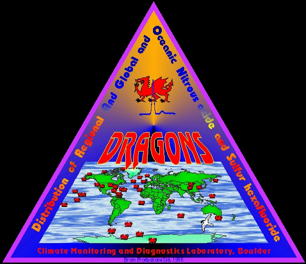
This is a logo for one of the hats/CCG cooperative projects. It's a project that collects nitrous oxide and sulfur hexafluoride data from about 50 sites from all over the world. I helped create the acronym and once that was done, I quickly came up with the idea of representing each sampling site with a dragon, together that makes a network of DRAGONS. This was also my first (long wanted) departure from elliptical logos. I had a bit of a problem how to put the acronym's meaning into the sharp tip, but I think overall, it's one of my favorites, because I like the shape, the ideas and the colors in it. Initially, I used the GOTHIC true type font for the acronym and had a shadow of it projected onto the map, but Laurie, who was heading the project, told me that it looks evil and made me redo it to a friendlier appearance. That also involved putting the peace dove in at the bottom, another animal (besides 50 dragons), which I also adopted in later logos.
This projectno longer has its own web page.
|