|
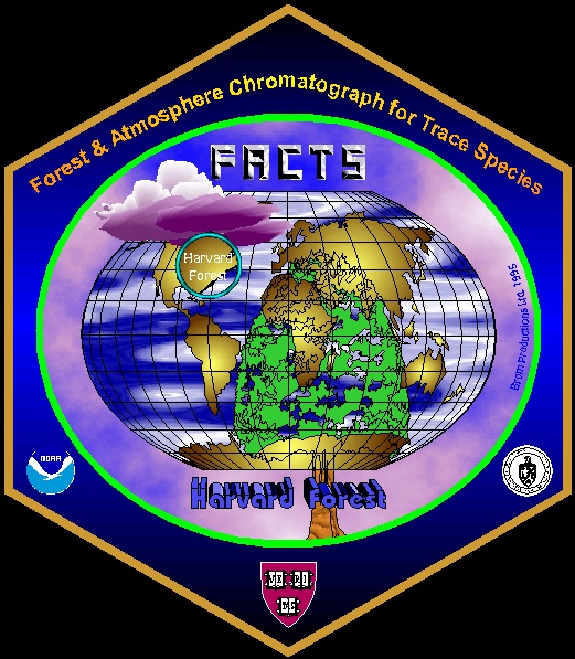
Another welcome departure from ellipses: a hexagon, which wasn't approved by the project initiator, but I used my artistic freedom to keep it. The shape gave me a nice possibility to place three institute logos without cluttering the actual logo. I also made heavy use of fractal backgrounds and I'm very proud of that tree that, combined with the continents, gives free sight on parts of the map and takes away some of the tree's dominance. The lense-effect over Harvard Forest is another nice touch. Heavy use of CorelDraw 5 features! The tree symbolizes the forest, the clouds and background stand for the atmosphere and oceans and continents round the picture for a suite of trace gas sources and sinks. Somehow, the bird in there got lost on the logo's way to the final version.
Here's some more info on the project: FACTS - the project.
|