|
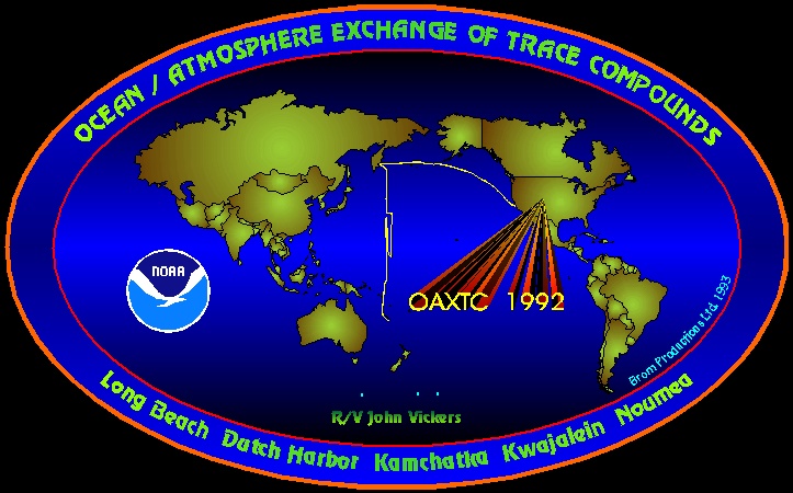
My very first logo! And I still like it very much, even though it has some missing continents
(hey, I needed that space for the NOAA logo), but I like the background's black-blue-black blend.
This logo took me about a year and a half to finalize. I made it during the first year in Boulder,
when I just started "doing Windows" and had to figure out, which program is the best one. I had very specific
ideas for the logo and couldn't find a program that did everything I wanted: 3-color background blends, curved text,
extrusion and maps. After many, many attempts and some frustrating delays, I ended up buying CorelDraw,
which was a steep investment, but well worth the price. I started with version 3 and keep buying the latest versions.
More than a year after I started the logo, I finalized it and that's what you see. After that, I went into
mass-production, see next pages.
The logo basically shows the final cruise track of the R/V Vickers ("The ship from hell", ask me about the wiggles around the equator, but don't mind if I start screaming and wildly beating around me. It's the memories of a very intense time! =:->). No motto or pet in the logo yet. Here's some more info on the cruise. With the acronym OAXTC, I created a real tongue-breaker. A lot of people can't pronounce it right at first and have a hard time keeping it in mind. After some initial resistance in the group, however, it is now a standing acronym at HATS, which not only stands for the mission, but is also the name of an instrument that I built.
|